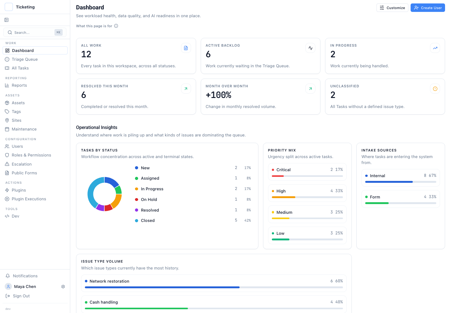
A shared operations dashboard can become too broad to act on. An operations lead needs headline workload and service-health signals. A queue supervisor focuses on status, priority, intake source, and issue-type concentration. An administrator monitors automation health and AI-readiness signals. When every section is fixed in one sequence, operators scroll past sections that belong to someone else's review. The dashboard becomes a metrics directory, not a monitoring instrument.
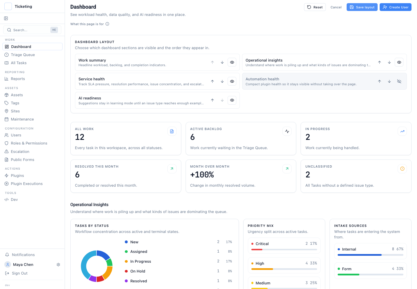
Latch now lets each operator choose which dashboard sections appear. The operator sets the order and saves the layout. The dashboard stops being a fixed broadcast. It becomes a monitoring surface assembled by the person who monitors.
Section visibility and ordering are saved per operator. The layout editor works with the dashboard sections Latch already provides: summary, service health, operational insight, automation, and AI readiness. An operator keeps the sections needed for a daily check and hides the rest. A key section can move higher. The saved order returns in later sessions. This is a personal configuration inside the operator's access boundary, not a shared view the team negotiates.
Role-aware availability means a section appears only when the operator has access to its underlying information. Customisation cannot grant access to a hidden section. It controls visibility and order only among the sections already available. That distinction keeps personalisation from becoming an access-control shortcut.
A customised dashboard is a triage surface, not an analytical report. It answers that question with a small set of widgets. When a pattern demands investigation, such as a spike in reopened tickets or a cluster of SLA breaches in one region, the operator opens a saved report. That report holds the measure, date range, filters, and grouping. Reports are for analysis. Dashboards are for monitoring. A dashboard that does both is too heavy for triage and too shallow for investigation. If an operator regularly opens the dashboard to study a widget, the work belongs in a saved report.
Decision guidance: keep monitoring on the dashboard. Start with the conditions that demand an immediate response. Work may pile up in one status. The priority mix may shift toward critical. Service health may move outside its expected range. An automation section may show a problem. Keep the dashboard sections that expose those conditions. If a question is reviewed occasionally or needs a precise date range and grouping, it belongs in a saved report.
Failure modes appear without personalisation. Without personalisation, operators compensate. They build shadow trackers in chat. They keep a second tab open. Or they stop looking at the dashboard altogether. A useful signal gets buried under sections the operator does not review. The cost is more than screen space. It is slower recognition of a change that deserves attention.
Personalisation carries its own risk. When every operator sees a different view, team-level alignment on shared metrics can erode. The morning standup becomes a negotiation over whose dashboard is "right". The safeguard is not a single forced view. It is a shared saved report definition. That gives the team one repeatable analytical starting point. The personal dashboard is the early-warning surface. The saved report is the repeatable workspace for analysis and review.
Honest limitations: widgets do not replace reports. Widgets show the measures the dashboard implements. They do not replace a report definition. If an operator needs a narrower question than the widgets answer, that work belongs in a saved report. This boundary is intentional. The dashboard monitors operational state. The reporting workspace supports controlled investigation.
Operator-level customisation is deliberately personal. Teams that want a consistent review ritual can document which sections belong in a role's daily check. Each operator still controls the saved layout. The dashboard does not become a global configuration that one person's preference changes for everyone else.
The customisation layer extends the reporting capabilities introduced in the operational reporting release and the metrics philosophy described in queue health measures beyond first response. The key addition is operator-level control over what the dashboard shows, without administrative changes to the shared view.
A dashboard that tries to serve every analytical question serves none of them well. Keep the dashboard focused on the sections an operator checks repeatedly. Move questions about a defined time window, grouping, or reusable analysis into a saved report.
Read the full context in the July product update.